Introduction
I have another website diving.anardil.net for the pictures I've taken while scuba diving around the Puget Sound, Canada, and South America. The site is really made up of 5 sub websites and hosts over 4,400 pictures!
For our purposes here, the interesting ones are:
Another side project of mine is poking around with matplotlib. In the project's own words:
Matplotlib is a comprehensive library for creating static, animated, and interactive visualizations in Python. Matplotlib makes easy things easy and hard things possible.
It really is an amazing library; once you have the basic pattern down, it does make it really easy to iterate visualizing data. It's what I'm using for sensors.anardil.net which shows temperature, humidity, and internet latency for my house.
Goal
Alright! We have a ton of pictures and a visualization library, what are we doing?
Even organized as the website pages are, it can be hard to get a sense of proportion between pages. There are a lot of nudibranchs, but are there more of those than of crabs? What about compared to anemones? Within the nudibranchs, what's most common?
And most importantly, I'd like to answer these questions with easy to understand visualizations rather than numbers in a spreadsheet or terminal.
Looking at the data
I'll be working with the pictures directly on my file system rather than
scraping my own website 🙂, but that would work too.
The source code that generates
diving.anardil.net has utilities to parse the folders and images into two main
hierarchies: common names (octopus, fish, etc) and scientific names
(Octopoda, Actinopterygii, etc). By hierarchy, I mean that the source code
organizes the pictures into a tree by name.
For instance, 2020-05-30 Rockaway Beach/012 - Juvenile Copper Rockfish.jpg
gets fit into the following tree:
The website and source code use the same tree representation. Let's start with the common names since they're a bit easier to eyeball and know what you're looking at.
>>> import collection
>>> tree = collection.go()
>>>
>>> type(tree)
<class 'dict'>
>>>
>>> tree.keys()
dict_keys(['shrimp', 'unknown', 'worm', 'eel', 'nudibranch', 'crab', 'fish',
'bryozoan', 'anemone', 'urchin', 'sponge', 'shark', 'star', 'egg', 'coral',
'wreck', 'limpet', 'chiton', 'octopus', 'tunicate', 'barnacle', 'hydroid',
'algae', 'lobster', 'diver', 'jelly', 'snail', 'ray', 'clam', 'scallop',
'shell', 'sea cucumber', 'dive site', 'sea turtle', 'bottlenose dolphin',
'marine iguana'])
>>>
>>> tree['crab'].keys()
dict_keys(['hermit', 'rock', 'helmet', 'dungeness', 'moss', 'decorator',
'porcelain', 'kelp', 'umbrella', 'scaled', 'rhinoceros', 'shore', 'clinging',
'heart', 'arrow', 'sharp nosed', 'spiny lithoid', 'reef spider', 'various'
'puget sound king'])
Eventually, the tree branches bottom out into a list of actual pictures.
>>> tree['crab']['helmet']['various']['data']
[Helmet Crab, Helmet Crab, Helmet Crab, Helmet Crab, Helmet Crab, ..., Helmet Crab]
So we have a tree of lists! We've hardly explored the tree and there's already a lot of information to consider; we need a way to summarize what we're seeing. What if we compared the sizes of sub trees?
>>> import utility
>>>
>>> [(k, utility.tree_size(v)) for (k, v) in tree.items()]
[('shrimp', 109), ('unknown', 17), ('worm', 201), ('eel', 104),
('nudibranch', 563), ('crab', 435), ('fish', 685), ('bryozoan', 53),
...]
That's looking more reasonable! We know there are more worm pictures than
shrimp pictures. But how to visualize it?
Finding a nice representation
We have some 1 dimensional labeled data. 1 dimensional because each element
only has a single value. Names like shrimp and eel aren't things we can
plot on a coordinate plane, they're labels. Let's peel that list of tuples
apart to make it more clear.
>>> pairs = [(k, utility.tree_size(v)) for (k, v) in tree.items()]
>>> names, counts = zip(*pairs)
>>>
>>> names[:8]
('shrimp', 'unknown', 'worm', 'eel', 'nudibranch', 'crab', 'fish', 'bryozoan')
>>> counts[:8]
(109, 17, 201, 104, 563, 435, 685, 53)
How about a bar graph?
import matplotlib.pyplot as m

import collection
from utility import tree_size

tree = collection.go()  # common names
sizes = {k: tree_size(v) for k, v in tree.items()}
names, counts = list(zip(*sorted(sizes.items())))
xs = [i for i in range(len(counts))]

m.bar(xs, counts)
m.title('Diving Pictures')
m.ylabel('Pictures')
m.xticks(xs, names, rotation=45, ha='right')
m.show()
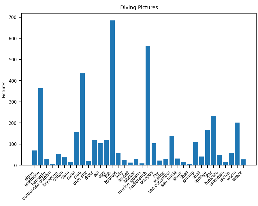
Hmm, nice but that's kind of a lot to look at all at once. Let's add some
grouping; we'll combine groups that don't have many pictures into an other
group that will represent them all together. We won't know what exactly they
are, but the chart overall will be more readable.
...
sizes = {k: tree_size(v) for k, v in tree.items()}

for k, v in list(sizes.items()):
    if v > 50:
        continue
    sizes.setdefault('other', 0)
    sizes['other'] += v
    del sizes[k]

names, counts = list(zip(*sorted(sizes.items())))
...
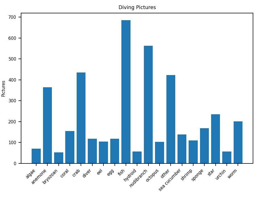
A couple things are clear already; there are a ton of pictures of crabs, fish, and nudibranchs!
Bubbles, packed and otherwise
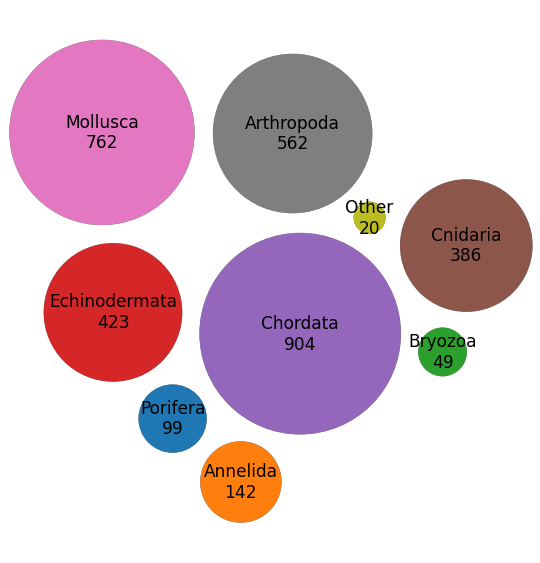
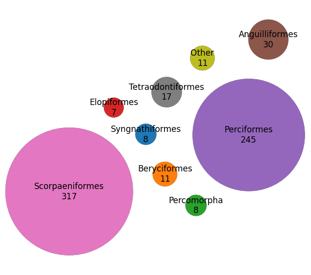
If I say "there are 201 pictures of worms", what does that mean? Is that a lot? Are they super rare? In general, the values in our data are only valuable when compared to each other, because there isn't an absolute scale available. In this case, a bar chart is giving us a bit more than we need.
What about a bubble chart instead? If we use the value for each label as the scale for the bubble's radius, we'd have a clear visual comparison between groups. A bigger bubble means more pictures, easy!
matplotlib has utilities to draw circles and bubble charts, but I specifically
want a packed bubble chart. This is where the circles are moved around in the
chart to fit them in as small a space as possible. This only makes sense when
the circles don't have some other spatial data (think of a population bubble
for countries on a map). Luckily, we don't have extra spatial data!
To this end, we'll be using an advanced example
script rather
than just a matplotlib builtin.
from plot_utility import BubbleChart

def packed_bubble(names, counts, spacing=5):
    ''' packed bubble plot using packed_bubbles.html from matplotlib.org '''
    chart = BubbleChart(area=counts, bubble_spacing=spacing)
    chart.collapse()

    _, ax = m.subplots(subplot_kw=dict(aspect='equal'))
    default_colors = m.rcParams['axes.prop_cycle']
    colors = default_colors.by_key()['color'] * 50

    chart.plot(ax, names, colors)
    ax.axis('off')
    ax.relim()
    ax.autoscale_view()
    m.show()

tree = collection.go()  # common names
sizes = {k: tree_size(v) for k, v in tree.items()}

for k, v in list(sizes.items()):
    ...
    del sizes[k]

sizes = {
    k.title().replace(' ', '\n') + f'\n{v}': 2 * v
    for k, v in sizes.items()
}
names, counts = list(zip(*sizes.items()))

m.rcParams['figure.dpi'] = 175
m.rcParams.update({'font.size': 7})
packed_bubble(names, counts)
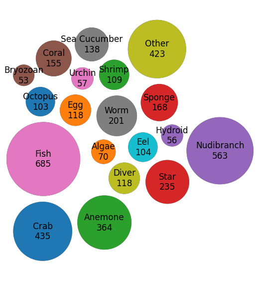
Cool! The work not shown is the tweaking of bubble_spacing, bubble
radius (2 * v), and font to make the bubbles and labels fit nicely. I gave
adjustText a shot but couldn't get it to
improve the look, though it did work and may work for a different use case.
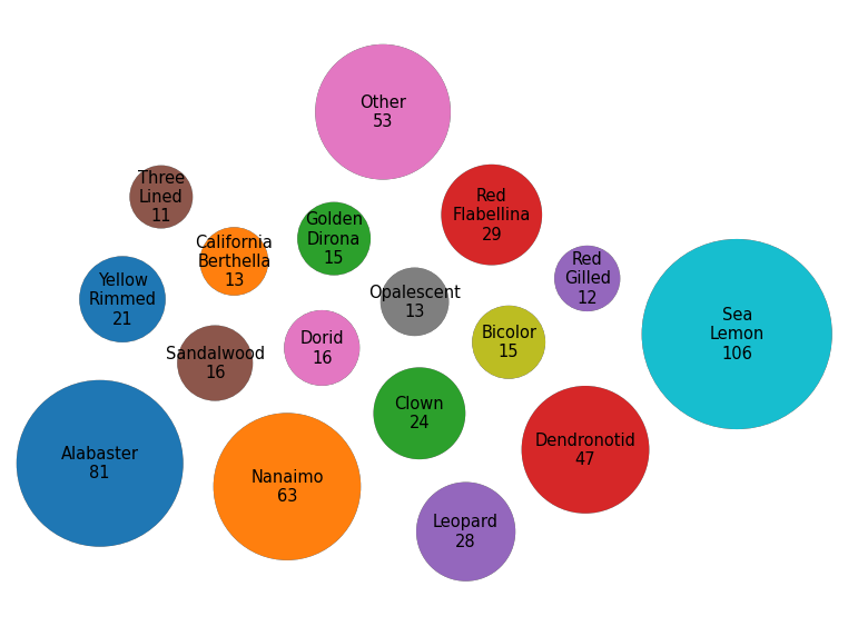
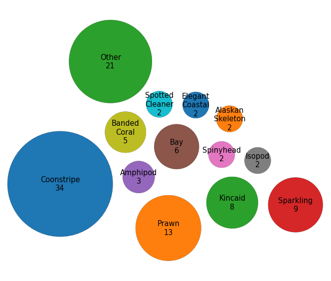
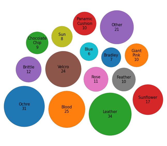
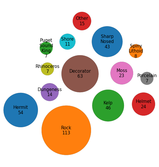
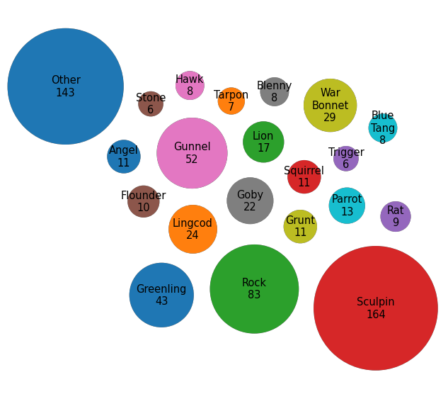
From here, it's easy! To visualize other parts of the tree, we just need to give our code a different root to start with (readjust the spacing, radius, etc as necessary), and voilà!
Nudibranchs
diving.anardil.net/gallery/nudibranch.html.
Shrimp
diving.anardil.net/gallery/shrimp.html.
Sea Stars
diving.anardil.net/gallery/star.html.
Crabs
diving.anardil.net/gallery/crab.html.
Fish
diving.anardil.net/gallery/fish.html.
Animalia (Animals)
diving.anardil.net/taxonomy/Animalia.html
Actinopterygii (Ray Finned Fishes)
diving.anardil.net/taxonomy/Animalia-Chordata-Actinopterygii.html
Conclusion
We used matplotlib to visualize some categorized diving pictures! The library
let us get started quickly and easily with a bar chart, and enabled much more
complicated packed bubble charts as well (just like the project description
said it could).